



Fast food logos have a funny way of unlocking memories you did not realise were still there.
Colours, mascots, and familiar shapes can instantly transport people back to school runs and weekend treats.
This list is a nostalgic look at designs many grew up recognising without a second thought.
This article is for general interest and nostalgic reflection only. Brand designs and logos may have changed over time.
1. Nestlé

The nest with birds logo is one of Nestlé’s oldest and most enduring symbols, first introduced in the late nineteenth century.
It was inspired by the founder’s surname, which means little nest in German.
The design was meant to represent care, nourishment, and family, closely tied to the brand’s early baby food products.
Although it has been simplified over time, the nest and birds motif remains a key part of Nestlé’s visual identity.
2. Pizza Hut Red Roof
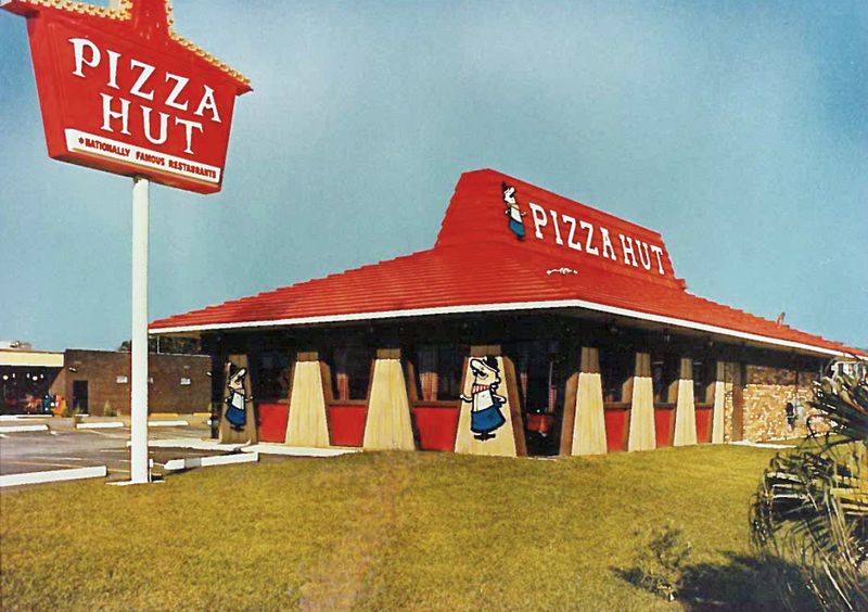
Pizza Hut's red roof logo was inspired by the actual shape of their restaurants, making it instantly recognisable from the street.
The design screamed cosy family dinners and all-you-can-eat buffets.
That chunky, retro font paired with the roof silhouette felt warm and inviting.
Seeing it meant cheesy pizza, arcade games, and good times with mates were just moments away.
3. Hardee's Star Logo
Hardee's star logo shone brightly with its bold red and yellow colours, symbolising quality and American pride.
The star shape was eye-catching and conveyed a sense of excellence in every burger served.
Older versions had a thicker, more retro style that felt authentic.
It promised hearty meals and great value, making every visit feel like a five-star fast food experience.
4. Burger King
The original Burger King logo featured the brand name sandwiched between two stylised buns.
This design clearly communicated what the chain was about before minimalist branding became popular.
Bold colours and rounded lettering gave it a playful, approachable feel.
It reflected a time when fast food logos were literal, cheerful, and instantly readable.
5. KFC Colonel Sanders Classic Logo
Colonel Sanders' face has been the heart of KFC since the beginning, but the old versions had a distinctly hand-drawn charm.
His warm smile and Southern gentleman look made everyone feel welcome.
The vintage logo featured bolder lines and a more cartoonish style.
It's a nostalgic reminder of when fried chicken came with that homemade, family recipe feeling.
6. Pepsi
Earlier Pepsi logos placed the word Pepsi directly inside the circular emblem.
The design leaned heavily on red, white, and blue to emphasise its American roots.
Typography was more prominent, making the brand name impossible to miss.
Over time, the logo became simpler, gradually reducing the role of text.
7. Wendy's Pigtails Logo
Wendy's logo starred a freckled girl with red pigtails, inspired by founder Dave Thomas's daughter.
Her friendly face and wholesome look gave the brand a homey, trustworthy vibe that stood out.
The older design had thicker lines and a more hand-drawn feel.
It reminded everyone that fresh, quality burgers could come with a smile and a personal touch.
8. Heinz
Classic Heinz logos often used bold black lettering with a strong, confident presence.
The typography focused on clarity and trust rather than decoration.
This straightforward style matched the brand’s emphasis on consistency and reliability.
Modern updates kept the recognisable lettering while softening the overall design.