






Ever wondered why your favourite snacks look the way they do? Behind every recognisable food package sits a cracking design story.
From happy accidents to calculated marketing brilliance, these visual identities have become as important as the tastes themselves.
Let's explore the fascinating tales behind the logos and packaging that make us reach for certain products without even thinking.
1. Jif Lemon
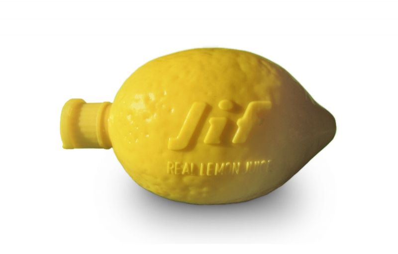
That cheeky plastic lemon has been squeezing into British kitchens since the 1950s. The genius lies in its simple mimicry - a plastic container shaped exactly like the fruit it contains.
Originally created by food technologist Edward Hack, this clever design solved the age-old problem of keeping lemon juice fresh while making it dead easy to use.
2. Lindt Gold Bunny
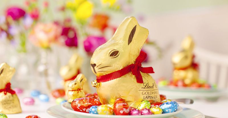
That shimmering gold-wrapped chocolate rabbit with its red ribbon and tiny bell has been hopping into Easter baskets since 1952. What began as a simple seasonal treat transformed into a masterclass in iconic seasonal packaging.
The design's brilliance lies in its recognisable silhouette - you know exactly what it is from across the shop.
3. Toblerone
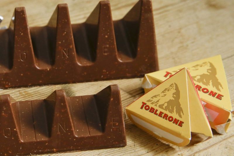
Those distinctive triangular chunks weren't just a random design choice. Created in 1908, Toblerone's unique shape was inspired by the Matterhorn mountain in the Swiss Alps - a nod to the chocolate's Swiss heritage.
Even cleverer, the mountain silhouette contains a hidden bear (Bern's symbol, where it was created). Talk about packing meaning into every bite!
4. Pringles
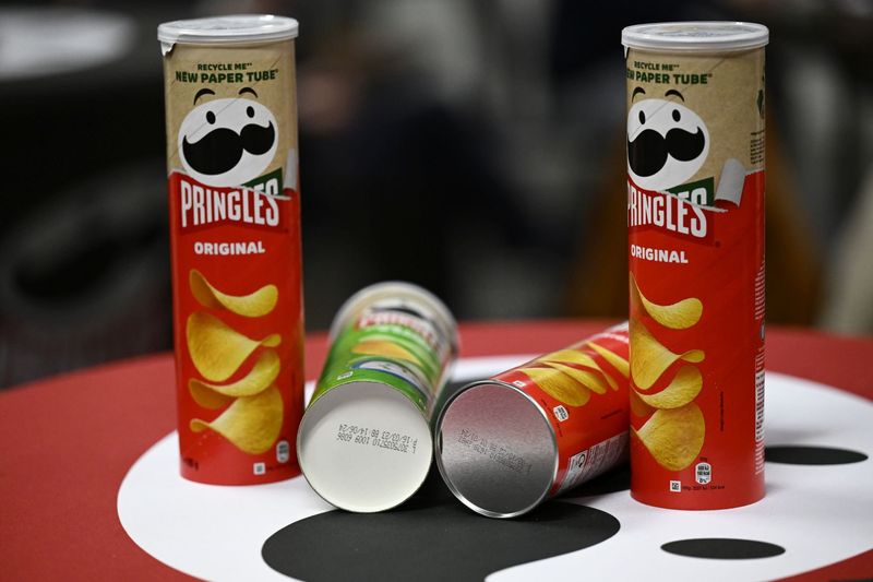
The mustachioed man on these stackable crisps wasn't always so dapper. Mr. Pringle (officially named 'Julius') was designed in the 1960s by Harley Procter & Gamble employee Fredric Baur, who was so proud of his creation he had his ashes buried in a Pringles can!
The uniformly shaped crisps and their tubular packaging solved the problem of broken, stale crisps.
5. Nutella
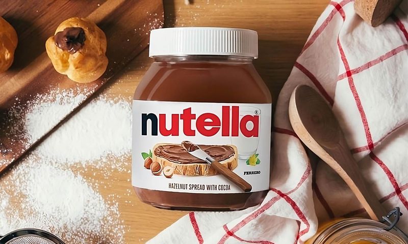
The squat glass jar with that white plastic lid has barely changed since the 1960s. Its creator, Michele Ferrero, deliberately designed it to resemble a jam jar to encourage Italians to spread his chocolate-hazelnut concoction on bread for breakfast.
The distinctive shape has become so iconic that even empty jars are repurposed as drinking glasses in homes across Europe.
6. Heinz Baked Beans
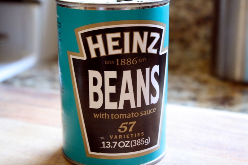
The turquoise tin with that unmistakable tomato-red label has been a cupboard staple since 1886. Remarkably, the design has barely changed in over a century - proof that some things simply don't need improvement.
Henry Heinz was obsessed with cleanliness, choosing the transparent turquoise to suggest purity at a time when food adulteration was common.
7. Coca-Cola
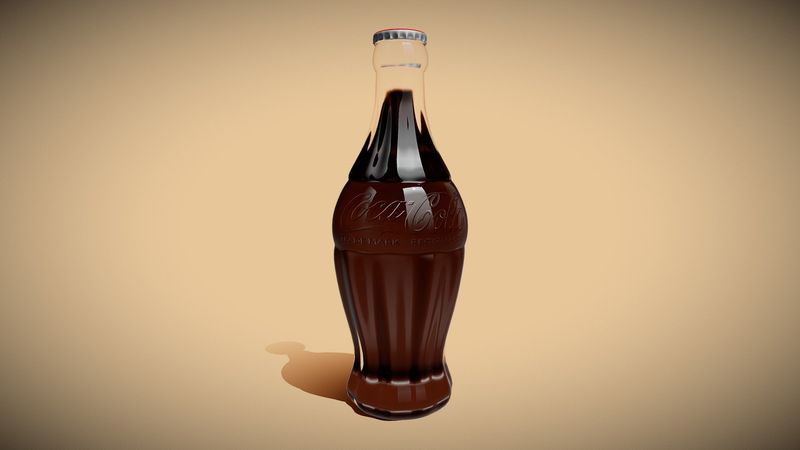
The curvy bottle wasn't just pretty - it was strategic genius. Created in 1915, the distinctive shape was designed to be recognisable even in the dark or broken into pieces.
The flowing script logo, meanwhile, was penned by bookkeeper Frank Mason Robinson, not some fancy design agency. His flowing Spencerian script, popular in American business writing at the time, has remained essentially unchanged for over 130 years.
8. Cadbury Dairy Milk
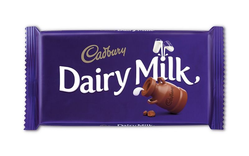
That royal purple wrapper wasn't chosen for its regal associations but reportedly because it was Queen Victoria's favourite colour. The flowing script logo, created in 1921, was based on William Cadbury's signature.
Most fascinating though is the 'glass and a half' symbol, introduced in 1928 to illustrate the milk content. This simple visual has survived nearly a century of rebrands, becoming shorthand for Cadbury's generosity.
9. Walkers Crisps
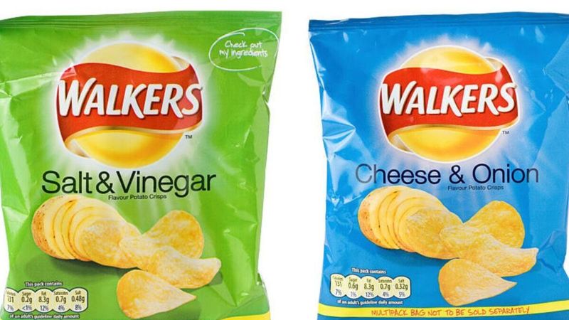
The red and blue packets weren't always the brand's signature colours. Until the 1980s, Walkers' cheese and onion crisps came in green packets and salt and vinegar in blue - the industry standard.
They accidentally switched the colours during a rebrand and sales unexpectedly increased! Rather than correct the 'mistake,' they kept it, creating a distinctly British crisp colour code that confuses foreign visitors to this day.
10. HP Sauce
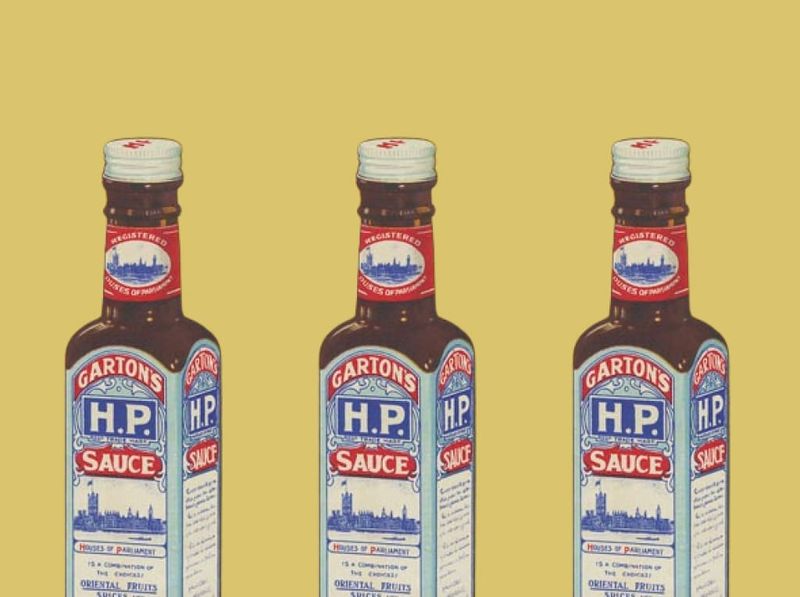
The Houses of Parliament have graced this brown sauce bottle since the 1890s. Legend has it that a restaurant near Parliament was the first to use the sauce, hence the iconic image.
The distinctive brick-shaped bottle with its paper wrapper was designed to stand out on crowded tables. Even more cleverly, the sauce's full name - 'Houses of Parliament Sauce' - reinforced its credentials as the establishment's preferred condiment.
11. Ben & Jerry's
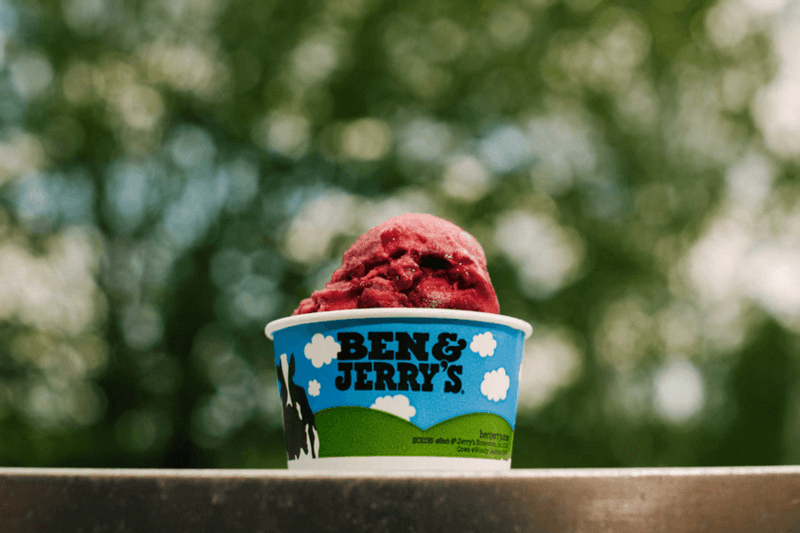
Those playful, cow-spotted containers weren't just a cute design choice. The founders deliberately chose the chunky, hand-drawn aesthetic to communicate their homemade, counter-culture values against corporate ice cream brands.
The cloud-filled blue sky backdrop represents Vermont's clean environment, while the cartoon cows reflect their commitment to family farms. Even their font choice - chunky and slightly wonky - reinforces their 'hippie business' ethos.
12. Mars Bar
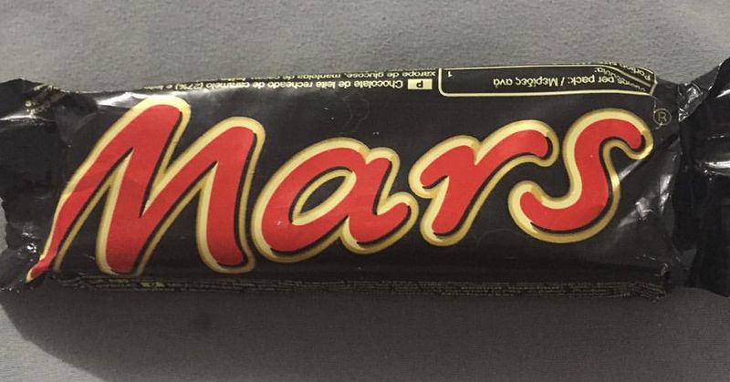
That striking black wrapper with red-gold lettering wasn't just about standing out on shelves. When Frank Mars created the bar in 1932, black was considered luxurious and sophisticated - perfect for positioning his chocolate as premium during the Great Depression.
The bold, angular typography was also ahead of its time, abandoning flowing scripts for something more modern and impactful. Even today, you can spot that distinctive wrapper from across a crowded shop.
13. Yorkshire Tea
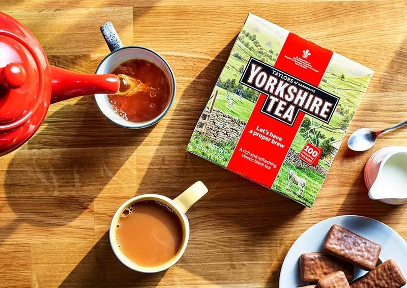
The bold red box with its landscape illustration isn't just pretty packaging - it's strategic storytelling. The rolling Yorkshire Dales scene evokes exactly what the brand represents: traditional British values and countryside authenticity.
Even more clever is the use of 'proper' in their marketing language. This simple, unpretentious word perfectly captures Yorkshire's straight-talking culture while positioning competitors as somehow less authentic.
14. Barilla Pasta
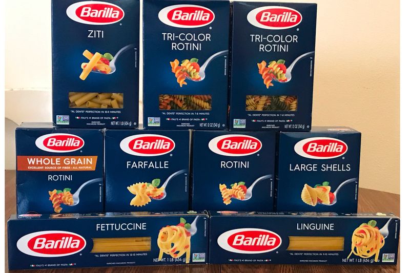
The iconic blue box with its simple red logo has remained virtually unchanged since 1952. What looks like minimal design now was actually revolutionary then - Barilla was among the first to package pasta in cardboard boxes rather than loose paper wrapping.
The royal blue background was chosen to suggest reliability and tradition, while the elliptical logo creates a sense of movement. Even the transparent window was innovative, allowing shoppers to see the product quality.
15. Guinness
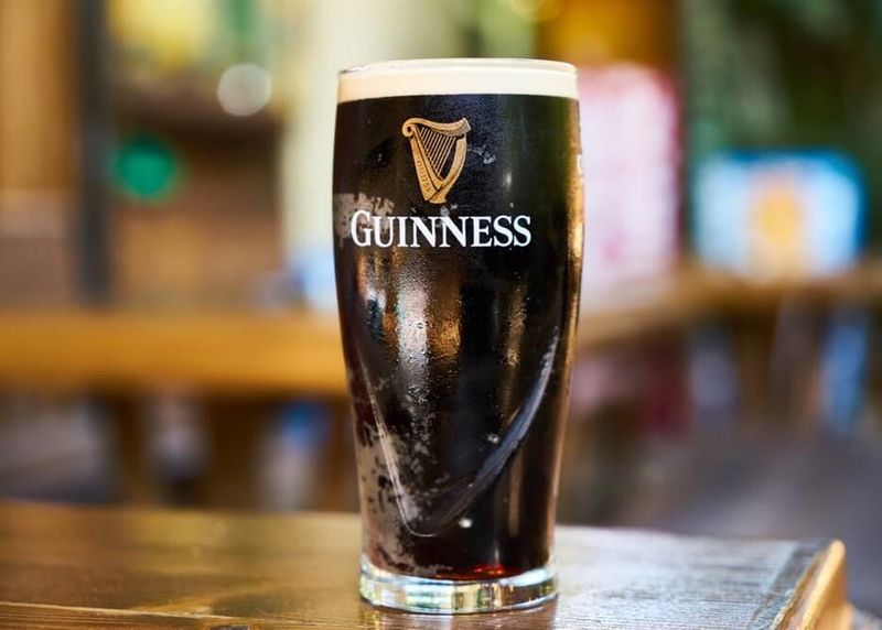
The iconic harp symbol wasn't randomly chosen - it's the national emblem of Ireland. Guinness actually registered it as a trademark in 1876, forcing the Irish Free State to reverse their version when adopting it as their national symbol in 1922!
The distinctive toucan from their 1930s and 40s advertising campaigns, meanwhile, was chosen because the 'two cans' of Guinness created a simple visual pun. Brilliant marketing, served in a perfectly designed glass.